Case 03 · 2026 · Trade · Europe
One name.
Every market.
The rebrand of a trading company growing across France, Germany and Italy.


01The evolution
From a globe to a name.
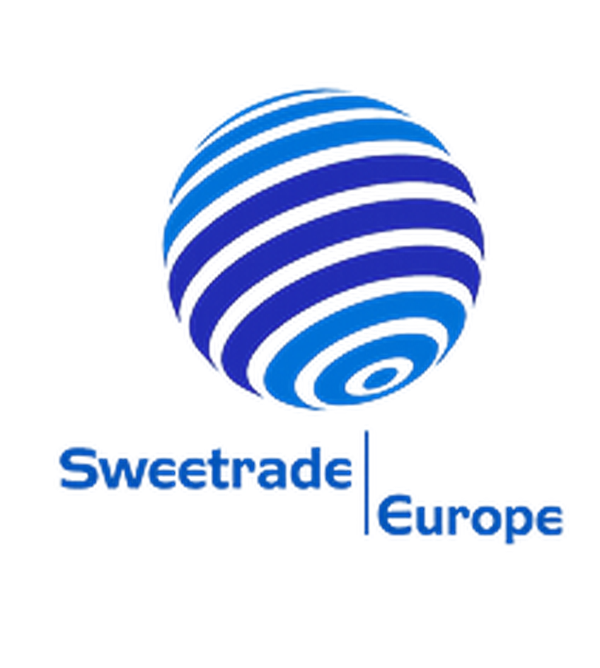
Before Original identity
A striped globe carries the brand. The name sits below it, small and split in two.

After New identity
The symbol goes and the name becomes the logo, with one letter left free for colour.
What changed
The direction was to modernise by simplifying: fewer elements, and a name that holds on its own.
BeforeAfter
SymbolStriped globeNone, the name is the mark
TypeLowercase, medium weightHeavy capitals
LayoutStacked, split by a thin lineOne line, EUROPE spaced below
ColourBlues throughoutNear black, colour only in the A
02The new identity
One name, on one grid.
Wordmark Construction
A heavy, steady name
Wide capitals on one cap height and baseline, with EUROPE spaced out below, so the name holds at any size.
03Partner campaign
On the road with US Bowling.
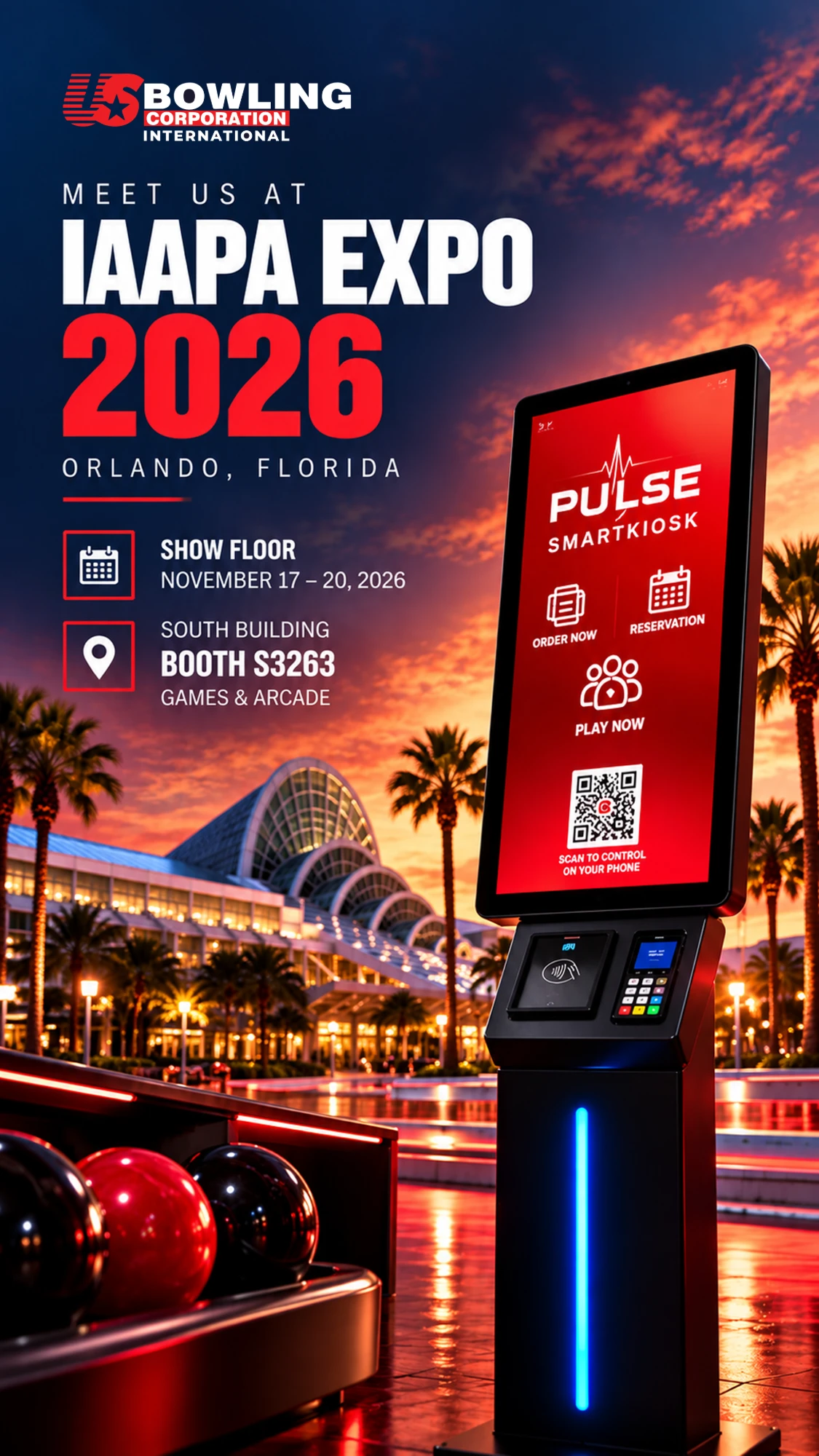
Visuals I prepared for Sweetrade's partner, US Bowling Corporation International, announcing its presence at IAAPA Expo in London and Orlando.